-svg.svg)






Vissers Legal
Teamplayers in corporate law, gambling & sports law

One brand strategy, three specialisations
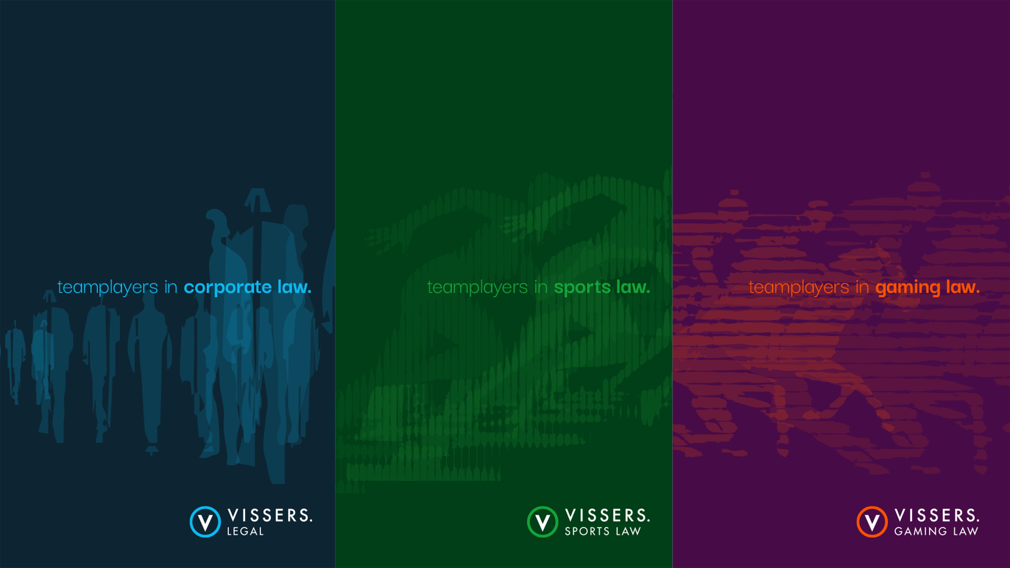
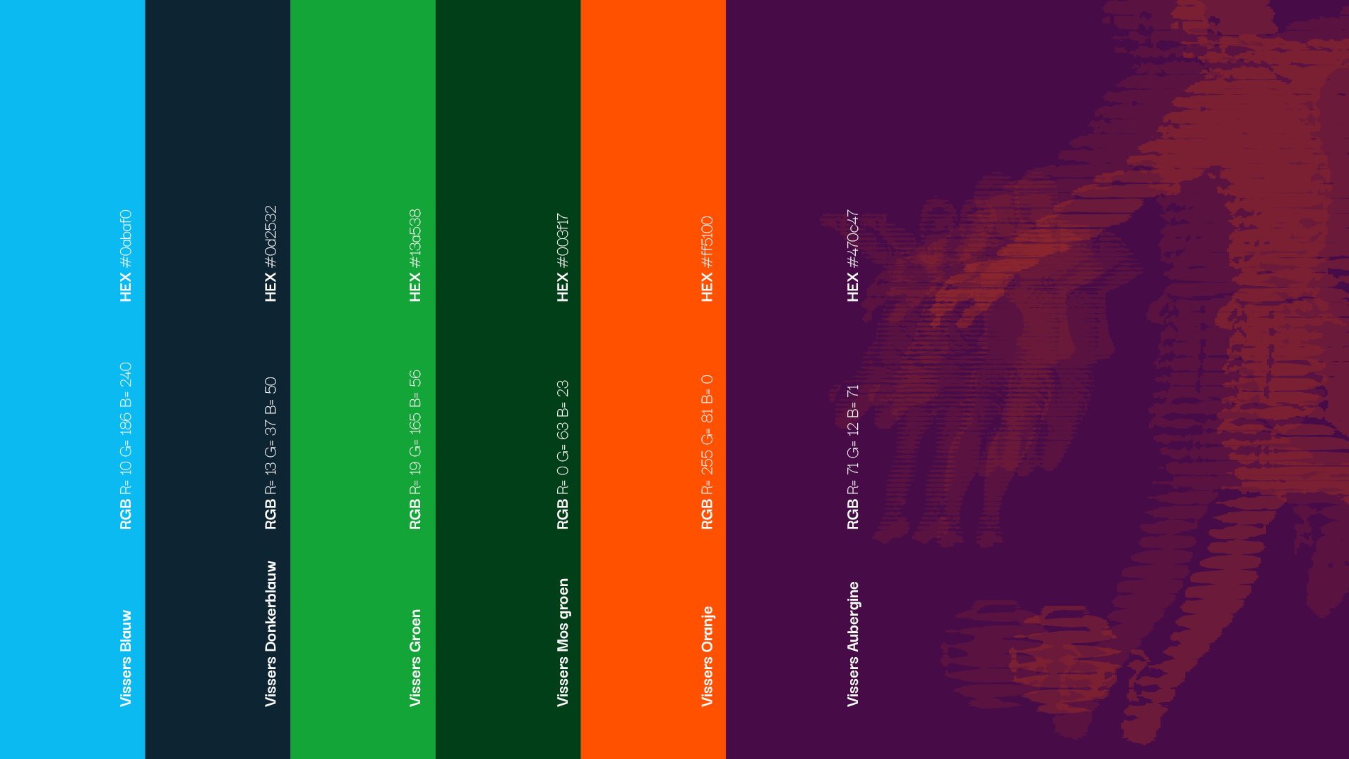
To better position these specialisations, we developed a label structure within Vissers Legal. Not as separate brands, but as recognisable extensions of the corporate identity. The same visual language and structure, differentiated through colour and naming: Vissers Gaming Law and Vissers Sports Law. This keeps the brand unified, while creating clearer distinctions between the different areas of expertise.
Branding inspired by iconic design
We introduced a tone-on-tone visual identity inspired by the design language of the 1972 Summer Olympics. Combined with a fixed line grid system, this creates a visual framework that feels calm and refined, while remaining distinctive and easy to translate across all brand assets.
Also in our hall of fame
More success stories

Taxperience
Iconic identity
Get a tax and notary office. And make it different from all the others. Taxperience from Den Bosch has not been so standard for years. The team at Capital Advertising gave them a corporate identity to match that look. With iconic figures, vibrant colours and a new pay-off.