Few people pay attention to typography while reading a text. Yet good typography and design has a huge impact on the readability of the text. Good typography makes itself invisible, in other words; bad typography is visible.
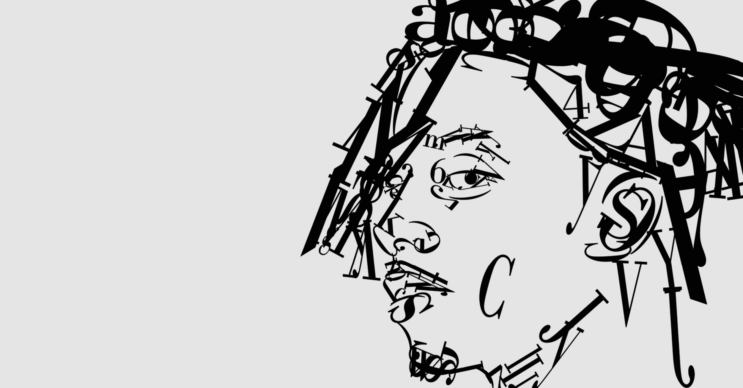
It is not only the choice of the right letter that matters, but also things like spacing, hyphenation and font size determine the accessibility of texts. There are thousands of fonts available and new ones are still being designed every day. These can be divided into groups or font families. But the most relevant distinction that can be made between fonts is that between serif and sans serif fonts. A serif is the 'foot' of a letter: the widening you see at the ends of an uppercase letter 'I', for example.
Subtle contrasts
The fonts that are most pleasant to read are the classic serif fonts. These may be new versions of the original designs or new fonts drawn in the same tradition. These fonts were originally developed for long documents. In fact, in the late fifteenth century to the early seventeenth century, all printed matter consisted of long documents. There were almost no brochures, advertisements, business cards, packaging... There were only books then. Opinions differ on the cause, but extensive studies have shown that long pieces of text are easier to read when set in a typeface with serifs. Perhaps it is the serifs themselves that lead the eye from one letter to another, so that the letters are automatically formed into words. Perhaps the subtle contrast between thick and thin, which is lacking in most sans serif fonts, also plays a role.
Sans serif fonts
In 1816, William Caslon IV designed a two-line Egyptian typeface omitting all serifs because he disliked them. This typeface was not a great success. Only when Bauhaus was founded in 1919 did sans serif fonts start to become popular. Under the motto 'form is subordinate to function', typefaces were stripped of all ornamentation into the most functional and simple fonts. People also called them 'monoweight' because there is no longer any difference between thick and thin. The font shape is the same thickness everywhere. So although this font is proven to be worse readable, it is widely used. Even in newspapers.
The letter family has a distinctly more modern look, and in many cases that appears to take precedence over optimal legibility. And speaking of readability... Sometimes a writer thinks he can get extra attention for text by writing it entirely in CAPITAL LETTERS. But that is harder to read than text in lowercase letters. We don't read letter by letter, we read in word groups. When we see a word, we recognise it, and move on to the next one. The shape of a word plays an important role in its recognition. However, if a word is set entirely in capitals, the shape of the word is rectangular and we do have to look at the letters. Text entirely in capitals is thus more difficult to read.
The right proportions
All in all, good typography is craftsmanship. Craftsmanship that gets little recognition because good typography does not stand out. Typography largely determines the communication power of books and magazines, posters, advertisements and so on. A good designer looks at the purpose of the text. Looks at the right proportions (is the text written with headings, sub-headings, body text, captions, etc.) and then adjusts the typography accordingly. But the typographer also answers questions such as: In what way do I divide my page? Do I choose two, six or 12 columns as the basis for my grid? How will I place the text? Capital Advertising's designers like to sink their teeth into such typographic challenges. This also applies to graduate Esther van Vught, whose research formed the basis for this article and a permanent position at Capital Advertising.
CAPITALS
When cigarette manufacturers were obliged to print bold warning texts on packets, they initially did so in CAPITALS. After all, that typography is the worst read. There had to be additional government regulation to make the texts legible on packs.